Intuitive Filter UX
Improving the filtering experience on Bevi's service portal.
1 UI/UX Designer (me!)
1 Product Manager
Timeline
August 2025 - Present
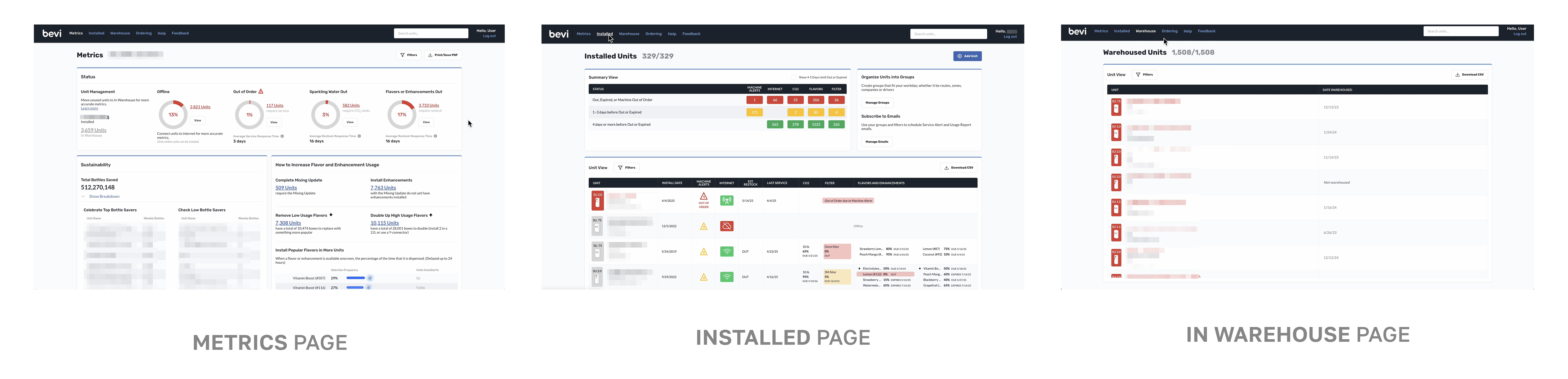
The Well is a web app used by operations teams to remotely monitor their Bevi machines. It allows them to proactively service machines, by providing real-time status updates on all machines installed, supporting a joyful hydration experience for all Bevi customers.
When a Bevi machine is installed, it is a requirement for the machine to be connected to the internet. The information from the machine is sent to a cloud, and the Well pulls that information about the machine from the cloud, every 30 seconds. Essentially, the machines “talk” to the Well.
Connectivity and registration information are essential steps in assuring the machine’s ability to communicate with the Well. Without them, we lose visibility into a number of important metrics and alerts on the machines.
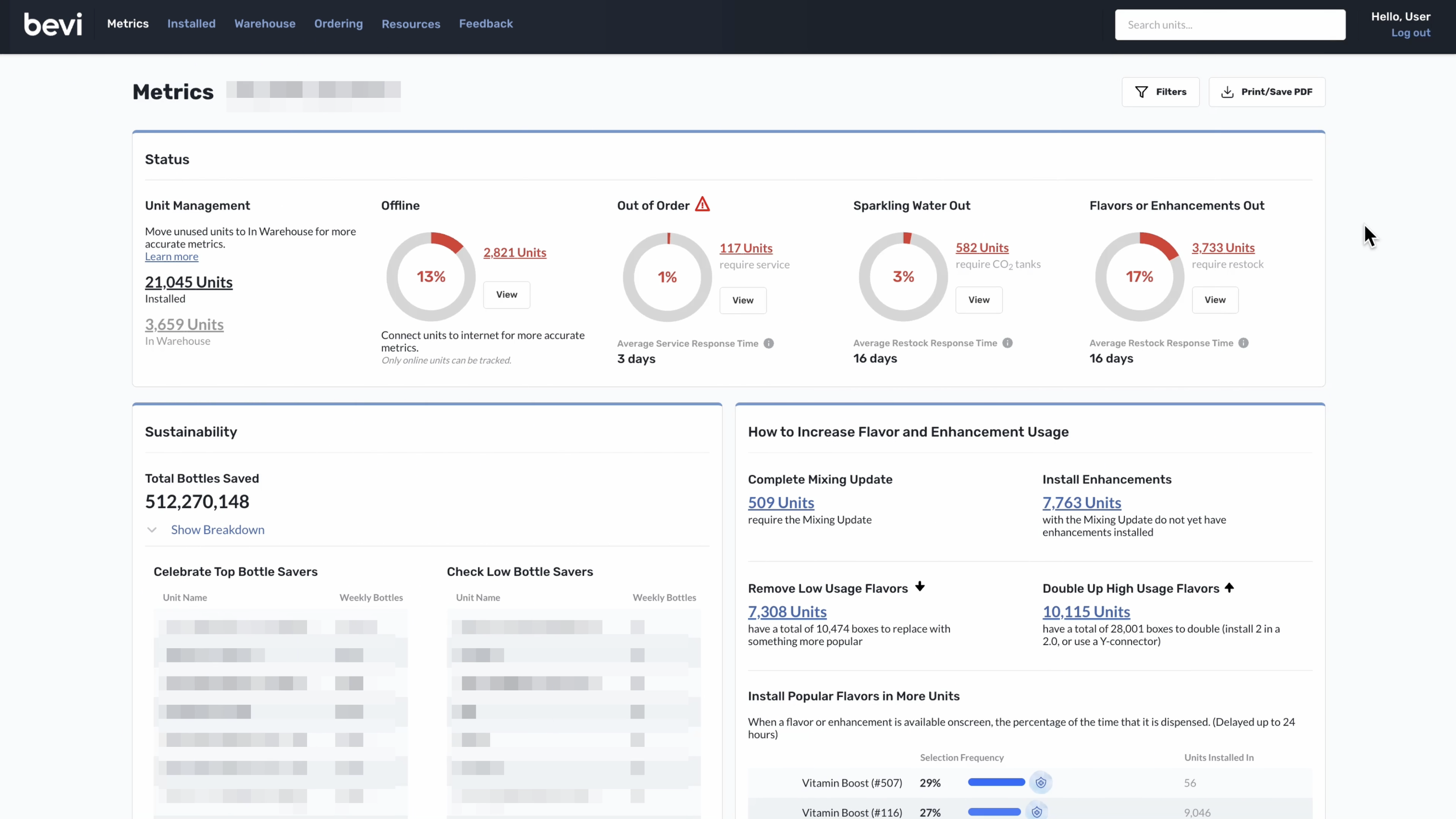
Below is a snapshot of the most important pages on the well, which help our users track quick high-level machine health data, inventory, service alerts, and more.
Over the years, we had received numerous complaints about filters in the Well from our partners, internal team, and other users, specifically on their dependency (or lack of thereof) on each other, confusing design, and illogical functionality.
Improve the filter experience on the Well so that users can easily narrow down the things they want to view.
Dispense Experience
Conducting a 6-month long user experience research and design project on the key customer-facing beverage dispense experience.
1 UI/UX Designer (me!)
1 Product Manager
1 Senior UI/UX Designer (manager)
Timeline
July - December 2023
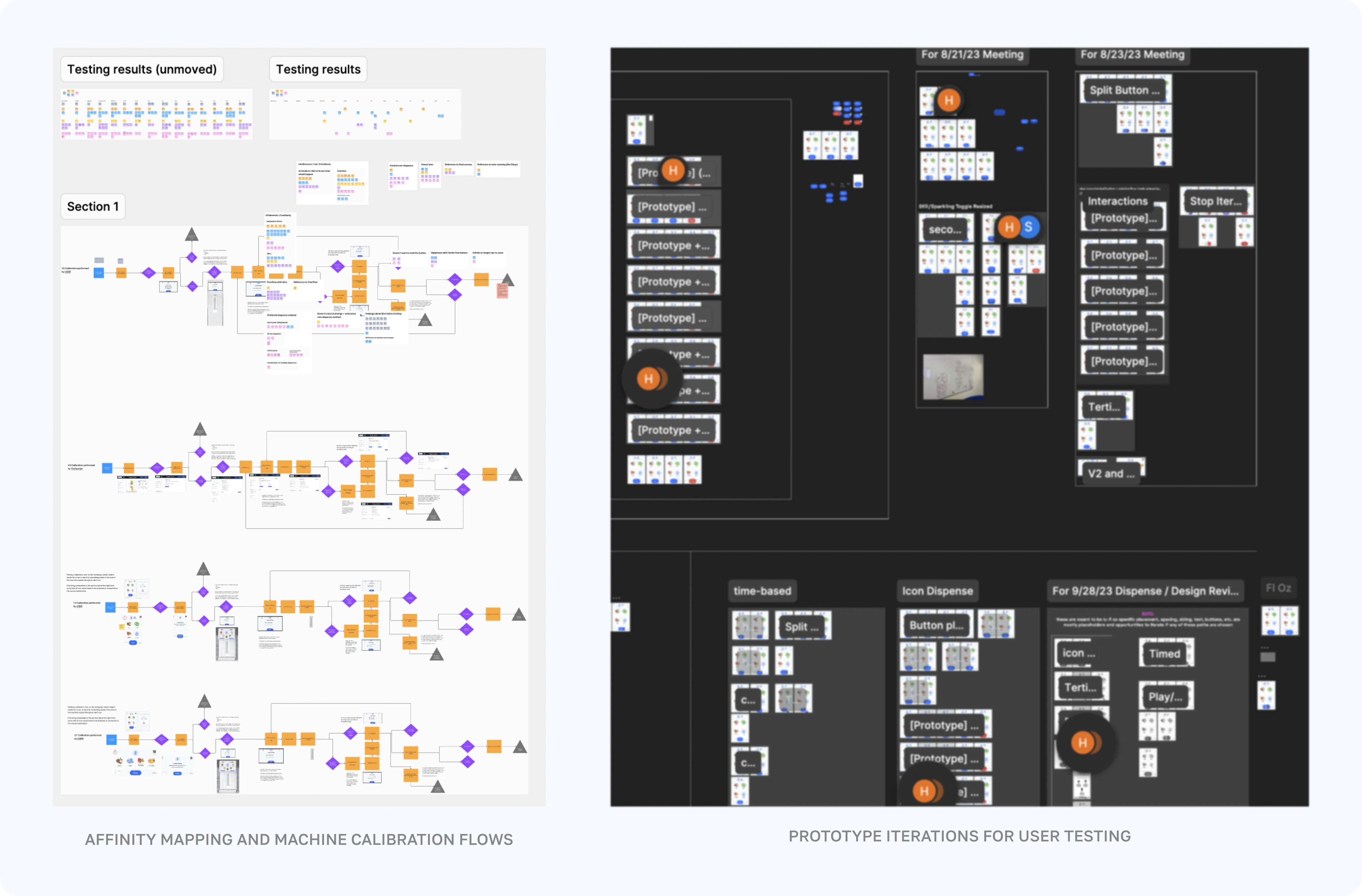
I, along with the Product Management co-op, led a 6-month long user experience research and design project on the key customer-facing beverage dispense experience.
This involved a drastic change to the main UI, displayed on 23,000+ installed machines across the world.
I performed user research, competitive analyses and usability audits, extensive wireframing and design iteration, prototyping, affinity map analyses, and much more.
We traveled to various customer sites in the Boston area and performed 25+ usability test sessions with both internal and external users, gaining direct insights on how effective and intuitive our design changes were (or weren’t)!
As this project is sensitive with internal data and the UI changes are not released (yet), please contact me directly to learn more!
Global Flavor Ranking
Boosting user enjoyment with a cool statistic and improving visibility of all Bevi flavor offerings!
1 UI/UX Designer (me!)
1 Product Manager
Timeline
November - December 2023
Tools
Sketch, Figma, Zeplin
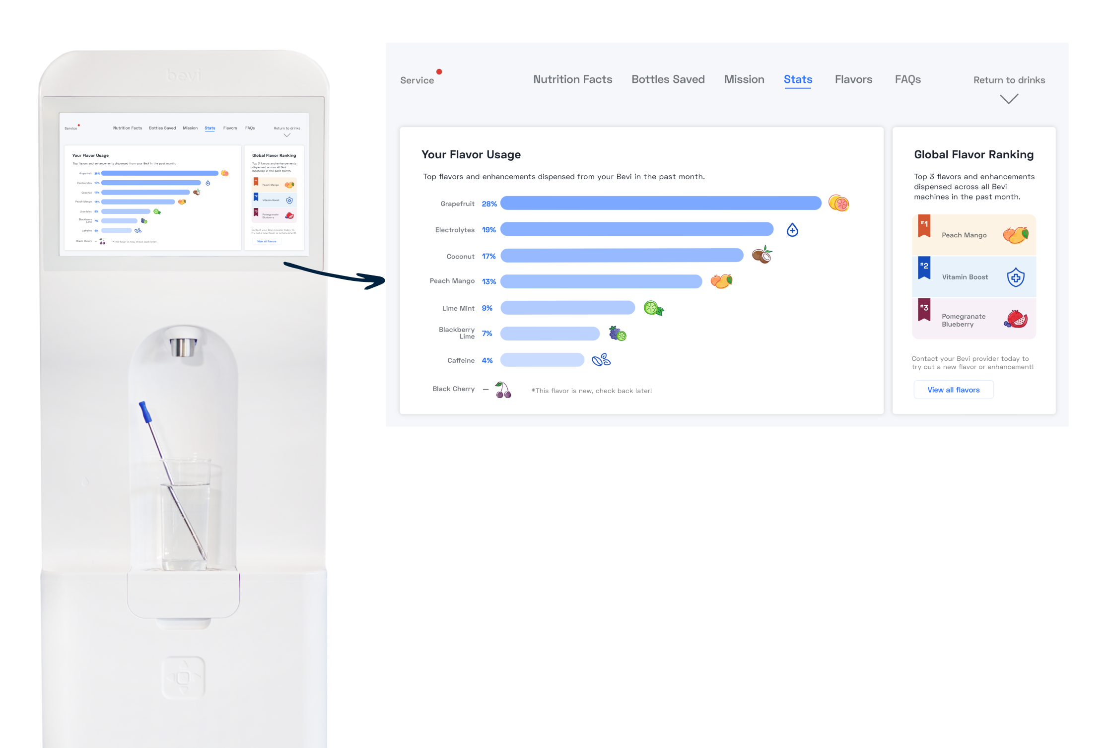
In October 2023, a new Stats page was released on all Bevi machines. This included data on that machine’s flavor and enhancement usage, in the form of a bar chart. This gained lots of positive buzz across our users!
“What now?”
No call-to-action suggests to the user on what they should do next with that information. The page is also lacking in additional statistics.
Provide directional messaging on the Stats page.
How might we...
Point out to users/office managers what’s globally hot…
So that...
They reach out to their Bevi provider to try out these flavors or enhancements.
The messaging should help users/office managers get a feel for what flavors or enhancements are popular that they may or may not be installed today. Ideally, presenting something like top globally used flavors and enhancements will encourage users/office managers to try something new! Especially, enhancements, if they haven’t tried them.
Global Flavor Ranking
This solution plays into the idea of a flavor competition and ranking to show what all Bevi users have been drinking.
If a user hasn’t tried one of these flavors before or it is not installed in their machine, its popularity sparks their curiosity, prompting them to reach out to their provider for a taste. This not only drives Bevi’s business growth but also enhances the variety of flavors customers can enjoy.
On the other hand, if the user has tried the flavor before, they feel more connected with the rest of Bevi users and feel in with the crowd — this is an increase in user happiness and satisfaction.
Revamped Usage Report
Increasing transparency on Bevi machine usage and modernizing an outdated design.
1 UI/UX Designer (me!)
1 Product Manager
Timeline
July - November 2023
The Usage Report is sent to all Bevi customers on a recurring basis – it includes data on their machine(s)’ usage, top flavors, etc.
The Usage Report needed to be revamped, to have:
- clearer displays of data
- actionable insights
- better visual appeal
- on-brand design & sustainability metrics
GOAL
Re-design to Usage Report to better display the data it provides, give the viewer clear, actionable insights, and provide important sustainability metrics. It should also better follow the design standards put forth in other Bevi platforms.
Feedback I gathered from an Account Manager and Partner representative on the original design:
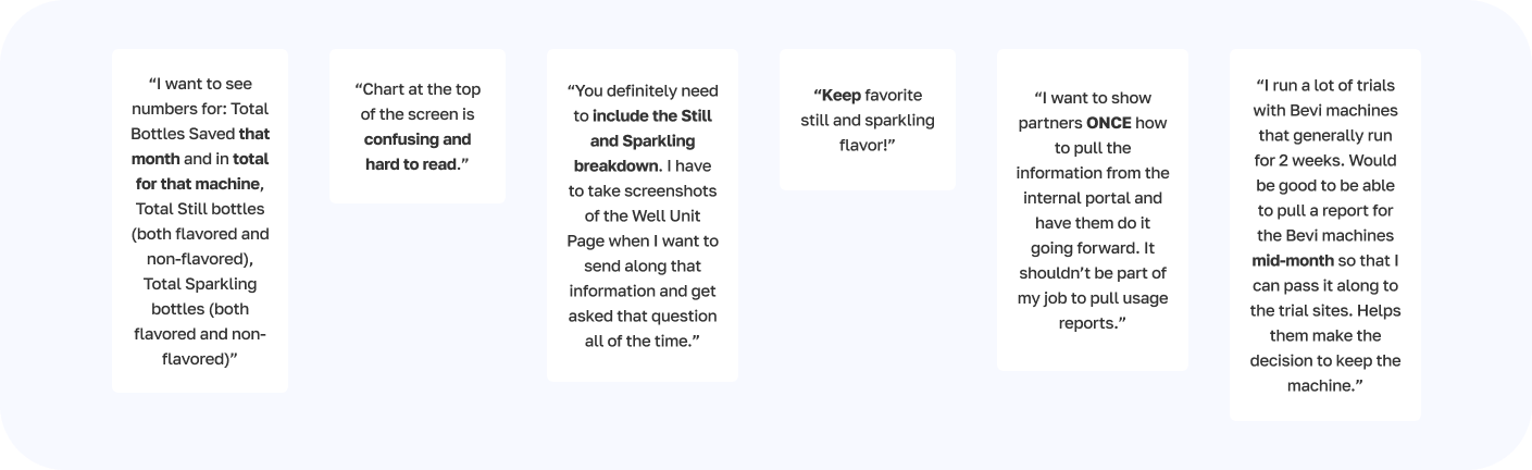
- Trial Use Case: ability to pull a usage report for any period of time like multiple months, not just monthly. (month view, quarterly view, month over month quarters, the past year)
- Reports per machine/account
- When on Bevi’s internal service portal, an ability to set up usage report there (download as PDF)
- Have the ability to pull a usage report from the portal that’s a usage summary for multiple machine units.
It was extremely important to make the usage report scannable and easy to quickly understand.
Narrowing down the desired content into 5 main sections
(Sustainability, Average Bottles Dispensed, Dispense (Still/Sparkling) Breakdown, Flavor and Enhancement Usage, and All-time Sustainability) would help the user easily find what they’re looking for on the report.
This launched in Spring 2024.
See
here for documentation on how to understand this report.